
Wandr
Crafting Your Unique Adventure. Effortlessly.
Service
Digital App
Client
Springboard
Role
UI/UX Designer

Background
Many people struggle with finding consolidated resources for planning trips and have to spend a considerable amount of time and energy to find the information that appeals to their preferences, which can get frustrating and burn the user out before their trip.
The internet does provide a plethora of resources which are fragmented on various different platforms, causing information overload and also putting the burden of discovery on the user.
Business Goal
The goal for Wandr was to create a platform which gives users the ability to quickly create trips by consolidating travel information and automating highly personalized itineraries for them.
For the users to feel in control of their trips while also being supported by the platform.
Target User
-
Between ages 18 - 55.
-
Travel for leisure.
-
Mid to high economic background.
Solution
To address all the problems being faced by the users, Wandr would need to focus on three important things;
-
Adding time-saving features like a personality quiz and preference settings.
-
Leveraging AI to gather and generate relevant results for users.
-
Empowering users with the ability to create unique trips without hassle - less steps, less time.

Secondary Research
To help me find what features to focus on, what tools to use for the best interactions and how to measure the success of the design based on established metrics, I conducted a competitive analysis to learn from the flow of three leading e-commerce travel sites - TripAdvisor, Booking.com and Wanderlog.
The top features these travel sites relied on for a good customer experience:
Ratings & Reviews
Rely heavily on consumer ratings and reviews to inform new users.
Preference Evaluation
Learn user behavior and patterns to generate relevant suggestions.
Exclusive Offers
Partner with hotels and airlines to get their users the best deals and entice them into using their platforms.
Quick Descriptors
Use of categories and descriptors to quickly inform users without having to click further.
Primary Research
I conducted 5 user interviews to understand the needs of the user and their behavior toward planning trips. I chose participants that had fulfilled the criteria of having traveled for pleasure within the last 24 months, did some form of research prior to a trip and had faced some form of issues during the process.
I focused my research on three main areas in order to make informed design decisions while improving the travel experience for user through Wandr.
-
How do users find the information the need to make travel plans?
-
What problems do they run into during the process?
-
How can we support the users by facilitating an optimal and smooth travel experience?

95%
of participants like to plan out their activities and trip beforehand.
85%
of participants use various online sources, like travel blogs, google and social media, to gather information prior to a trip.
90%
of participants usually find the process of planning a trip and gathering information overwhelming.
100%
of participants would like to have all the information relevant to their needs be consolidated one one platform.
" It would be more convenient if one platform gives me all the resources that I need so I don't have go through Google, Instagram and Tiktok - just to make sure I have all the information I need. "
Affinity Mapping
Using information collected from user interviews, I then created an affinity map showing the main take aways on the process of travel planning for the users - to better understand their needs and pain points.

Do
What Users Do
Notes
Screenshots
Bookmarks
Excel Sheets
App Hopping
Social Media
Yelp
TripAdvisor
Booking.com
Ticketing Websites
Google Reviews

Feel
What Users Feel
Stressful
Anxiety Inducing
Unorganized
Confusing
Frustrating
Time-consuming
Missing Information
FOMO
Overwhelming
Human Erros
Specific Keywords

Want
What Users Want
Relevant Information
Visual Cues
Preference Settings
Convenience
Starting Off Point
Consolidated
Automated
Seamless
Visualization
Tailor-made
Time-saving
Empathy Mapping
To further get into the mind frame of the users and understand their pains/gains, I also established an empathy map.
Think
Process is time consuming and not convenient
Miss out on relevant information
It's a lot of data and the process could be easier
Painful process to read all relevant information
Do
Cross-reference different platforms
Make excel sheets and lists
Take notes, screenshots and make folders
Save places on maps and bookmark sites
Pain
Finding/reading relevant info is stressful and anxiety-inducing
Missing out on events/attractions due to lack of relevant info
Scattered info makes it hard to keep track
Getting stuck with only popular touristy activities
Feel
Stressed and anxious
Overwhelmed
Frustrated
Confused
Say
"I don't have time to sit and read all the information."
"Planning is the most stressful and anxious part."
"You want to make the most out of you trip."
"Trying keywords and searches, it's not tailor-made"
Gain
Process could be more seamless, consolidated, automated
Preferences like ages, budget, level of activities etc are important
Being able to visualize all the info and activities divided by days
Tailor-made to suit particular interests and finding unique activities
User Personas
I used the data from the primary and secondary research to then put together two distinct personas to help better understand the user base and shift my design thinking onto real users who seek reliable and relevant information for their travel planning.


JTBD
The jobs to be done were then identified to really understand the user, create clarity and drive the point home as the users need a variety of issues addressed related to their travel planning, with different expectations and things they want to accomplish during each trip. They want to be able to achieve all those things with the least amount of stress and anxiety during the planning process.
Job Performer (Who)
-
Traveler
Circumstances (When/Where)
-
When visiting a destination for the first time
-
When going to multiple cities/countries
Jobs (What)
Main Job:
-
Plan a vacation
Related Jobs:
-
Have a stress-free vacation
-
Enjoy different experiences
-
Discover new things/places
Emotional Jobs:
-
Learn about and experience different cultures
-
Feel rejuvenated and inspired
-
Make memories
Social Jobs:
-
Meet new like-minded people
-
Have unique experiences
Needs (Why)
-
Reduce the time it takes to plan a vacation
-
Break through the clutter of information scattered all over the internet
-
Eliminate the need to cross-reference multiple platforms to get the necessary information
-
Consolidate different platforms required to plan various aspects of the trip
User Stories
Using the insights and major themes derived from the user interviews, I mapped out the user needs into user stories. For example, the ability to set preferences for every trip and have auto-generated activities which are relevant to the user but also gives them the option to swap them out if needed. Which were then separated into MVP and non-MVP, using the MVP stories as the key red routes.
As a traveler I want to...
MVP
...be able to find itineraries without hours of research so that I don't start the trip anxiously
...be able to access the information I need easily/fast so that I don't feel overwhelmed
...feel confident in my decisions while on a trip so that I don't have the regret of missed opportunities
...be able to feel safe and comfortable so that I can enjoy my vacation fully
...be able to find an itinerary that I can trust so that I can have peace of mind during my trip
...be able to find places I like so that I can make the most out of my trip
...be able to put in my preferences so I get recommendations for places which appeal to me
...be able to find a travel plan that covers all my needs so that I can travel comfortably
...be able to plan my trip seamlessly so that I don't get frustrated
...be able to visualize all the information regarding my trip so that I can keep track of everything and be organized
Non-MVP
...be able to put in my budget so that I don't overspend on my trip activities
...be able to be able to view multiple tri[s simultaneously so that I can multitask and plan in advance
...be able to edit the plans being made for me so that I can customize them further
...able to communicate with locals so that I can find authentic local experiences and hidden gems
...be able to find interesting and unique activities so that I don't miss out
...be given multiple itinerary options so that I can pick and choose which suits my needs best
...cross-check multiple sources so that I can make sure I get the most accurate information
...be able to book the tickets needed on the same platform so that I don't have to go to a second source
...be able to consolidate all the travel details so that I can keep track of everything
...be able to visualize all the information regarding my trip so that I can keep track of everything and be organized
User Flows
After researching users’ travel planning approaches in terms of how they find and save the information, I discovered that understanding and utilizing the user’s preferences and interests were of the utmost importance in making sure the users had access to suggestions which had been uniquely tailored to them and their needs. I focused on the Preference Settings as the main flow, as well as the Sign In/Sign Up and Planning a New Trip.
Going into trip planning with the User Preferences in place would ensure that the suggestions being generated are personalized, relevant and useful to the user, as well as being presented in an organized and approachable manner.

Preference Settings

Plan a New Trip

Sign In/Sign Up
Approach
By mapping out how our user needs would be answered in the critical red-routes, I now had the key touch points which needed to be addressed, for designing the travel planning app. WANDR would focus on three main features in the first round:
-
Creating an Account
-
Setting up a Trip and Generating an Itinerary
-
Setting Preferences
Some quick first iteration sketches were then created to start setting the visual hierarchy and making sure the key features were included.

Wireframes
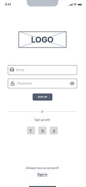
Based on the feedback received on the layout of sketches, some simple but important changes when converting the sketches to wireframes:
-
Simplifying and streamlining the sign in/sign up page.
-
Making the preference settings layout more straightforward.
-
Top navigation was made dynamic according to specific user flows.
-
State changes were added to buttons to give immediate visual feedback.
The wireframes helped solidify the visual hierarchy and clearly lay out the way information would be organized.


Performing the first round of usability testing, using the low fidelity wireframes, identified several areas where the user experience could be improved, particularly in the navigation and accessibility of key features like preferences, budget tracking and trip setup flexibility. Moving forward with the high fidelity prototype, these usability issues were made a priority and addressed in the redesign, which yielded better results with users in the second round of testing.
.jpg)
Design Decisions
It was important to position Wandr as a travel companion who is an adventurous explorer, a friendly guide, a reliable planner and a flexible adapter, to help the users feel supported and empowered throughout the process.
Using the findings from the research synthesis, wireframes were then created to test and nail down general directions, clarify content blocks and wireflows were created to help solidify the hierarchy and information architecture.

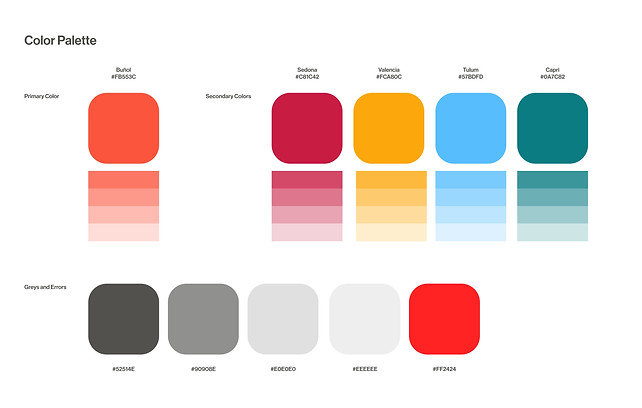
The design system was then simplified and the greyscale adjusted to a warm and vibrant color palette with images that feel unique and special.
In terms of typography, Neue Haas Grotesk was used as the primary font to maintain legibility and consistency.
The Process
As the primary designer, I was responsible for the user research, visual design and the user experience design for this app.
For more details about the research, design process and to view the prototype, click here.
.jpg)


The Results
• Streamlined user onboarding, with travelers now completing the initial trip setup faster.
• AI-driven personalization, generating unique, tailored itineraries with improved relevance in suggestions.
• Improved travel discovery, with personalized recommendations and suggested destinations/activities for users.
• Consistent branding, maintaining a visually cohesive design that aligns with the innovative and adventure-focused identity.


