Ripple
Stream anywhere.
Service
Digital App
Client
Springboard
Role
UI/UX Designer

Background
Ripple is an emerging streaming platform designed to offer a seamless and immersive listening experience for music and audio content, now wanting to introduce a premium, subscription-based service to deliver enhanced features. Initial user feedback suggested several key usability issues, users were often unclear about the benefits of premium features and didn’t always notice subscription prompts during their journey on the platform.
Business Goal
With perks such as ad-free streaming, offline downloads, and unlimited skips, this shift to a monetized model aims to provide users with additional value, while generating a sustainable revenue stream for the platform.
Target User
-
Between ages 14 - 65.
-
Subscribes to at least one premium service.
-
Mid to high economic background.
Solution
To increase the awareness of premium offerings for any users, new or returning, Ripple would need to focus on three important techniques;
-
Enhanced premium prompts within the user journey
-
Options for in-product upgrades for returning users
-
Revised feature restriction messaging for free users

The Purpose
To create a more engaging premium experience for Ripple’s users that felt both natural and compelling.
Secondary Research
I examined the premium user experiences of three leading apps in the space — Spotify, YouTube and Pandora. This analysis highlighted what resonated with users, what caused friction, and uncovered insights that could inform ideation for Ripple. It shed light on both the features users value most and the pain points that premium services should address.
WHAT USERS NEED
AD-FREE EXPERIENCE
HIGH QUALITY AUDIO/VIDEO
EXCLUSIVE
AND EARLY ACCESS
DOWNLOADS AND OFFLINE
ACCESS
CURATED
CONTENT
Then by further analyzing competitors and studying how other platforms attract users to their premium offerings, I identified key techniques Ripple can implement to enhance its user experience.
Emphasize the Premium Perks
Incorporate Upsell Opportunities into Signup and Onboarding
Create Visible CTAs
Throughout the Interface
Utilize Time-Limited Trials
and Flash Offers
Deploy Contextual Prompts
and Upgrade Suggestions
Engage Users With Listening Milestones and Achievements
Persona
I then utilized the insights from the secondary research analysis to inform a user persona, which would serve as a guiding reference throughout the design process. This persona captured key user behaviors, motivations, pain points and expectations, ensuring that the user flows were grounded in real needs and aligned with the habits and emotional drivers of our target audience. It helped to maintain empathy and focus while making strategic UX decisions.

User Flows
Synthesizing primary and secondary research helped identify four key user flows where premium offerings could be introduced without disrupting the free experience — during Sign In/Sign Up, within account settings and as in-app upgrade prompts triggered by attempts to access premium-only features.

Sign In/Sign Up

Account Settings

Premium-only Features
Wireframes
Low-fidelity wireframes were created for the four critical user flows to establish the foundational visual hierarchy and information architecture. These wireframes served as an early blueprint for how premium prompts would appear within the product, ensuring clarity and minimal disruption to the free experience.
At this stage, the focus was on layout, content prioritization and user navigation rather than visual design. This allowed for rapid iteration and feedback through an initial round of usability testing, helping validate the approach before investing in high-fidelity design.

The first round of testing uncovered several key issues which needed to be addressed;
-
Low engagement with premium messaging during the sign-up flow.
-
Subscription prompt in the sign-in flow was often overlooked.
-
Users had trouble finding the premium upgrade option within the product.
Several areas were identified where Ripple’s premium conversion flows could be enhanced to improve subscription rates and the overall user experience. By implementing targeted adjustments to the clarity and the placement and timing of premium subscription offers, Ripple could better align with user expectations, as well as effectively convey the value of the premium service being offered.
Design Decisions
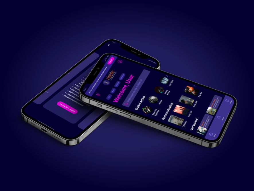
To enhance visual coherence and set the tone for a more premium look and feel, the existing low-fidelity design system was streamlined. Unnecessary elements were removed to reduce visual clutter and focus attention on key actions. The greyscale palette was refined and replaced with a dark color scheme featuring rich navy blues and purples, accented by vibrant pops of pink. This shift not only improved contrast and accessibility but also aligned the interface with Ripple’s brand personality — modern, bold and entertainment-driven. The simplified system also made it easier to scale and maintain consistency across screens during high-fidelity prototyping.

Once the visual language was nailed down, the next steps for the high fidelity prototype were identified, informed by the first round of usability testing;
-
Prioritize updates to the sign-up and sign-in flows to improve the visibility and appeal of premium options.
-
Implement the exit routes necessary for a smooth flow.
-
Refine the in-product premium upgrade options to ensure easy discoverability.

The Process
As the primary designer, I was responsible for the user research, interaction design, user interface design and user experience design for this case study. I created the project plan and set deliverables over the course of a month.
For a more detailed look at the process, click here.
The Results
• Enhanced onboarding experience, with premium users completing account setup and payment faster.
• Improved premium awareness, with enhanced upgrade prompts, leading to an increase in potential premium trial sign-ups.
• Optimized feature restriction messaging, showcasing the value of premium features and uplifting upgrade conversions.
• Seamless upgrade journey, with revised in-app upgrade flows, reducing friction and enabling users to complete subscriptions faster.
• Increased user engagement with premium-exclusive features, like downloads and skips, highlighting the value of upgrading.
• Consistent brand messaging, ensuring premium offerings are highlighted across all touchpoints, reinforcing Ripple’s premium identity.


